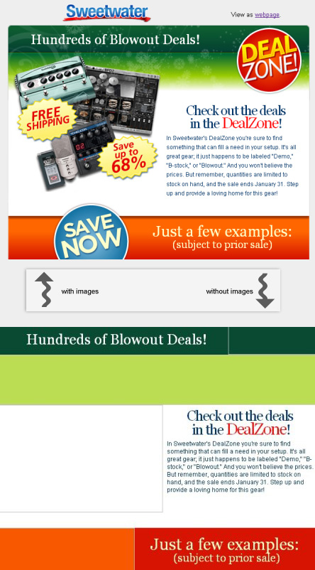
Getting typography right is hard enough, even when you have all of the image editing tools to aid. But as we all know, many times images are blocked on e-mail clients, which makes the task of designing an effective e-postcard with high penetration difficult. Sweetwater has done an nice job mixing an e-mail promotion with a graceful fallback on a recent e-mail promotion. Take a look at the email below with and without images. I especially like the second heading which uses a -2px letter spacing css attribute to achieve a nice kerning.

The ad was available here when I posted this.

